// Kafana — landing page sections. Composed by App.jsx into mobile + desktop frames. const { useState, useRef, useEffect, Fragment } = React; // Email capture — used in dedicated section function EmailForm({ id, dark = false, stacked = false, buttonLabel = 'Notify me.' }) { const [email, setEmail] = useState(''); const [state, setState] = useState('idle'); // idle | submitting | done | error const submit = (e) => { e.preventDefault(); if (!/^[^\s@]+@[^\s@]+\.[^\s@]+$/.test(email)) { setState('error'); return; } setState('submitting'); setTimeout(() => setState('done'), 700); }; if (state === 'done') { return (
You're on the list. Živeli.
); } const inputStyle = { background: 'var(--cream)', border: `0.5px solid ${state === 'error' ? 'var(--copper-deep)' : 'var(--whisper)'}`, borderRadius: 10, padding: '14px 18px', fontFamily: 'var(--sans)', fontSize: 16, color: 'var(--ink)', outline: 'none', flex: stacked ? 'none' : 1, width: stacked ? '100%' : 'auto', minWidth: 0, boxSizing: 'border-box', transition: 'border-color 220ms cubic-bezier(.2,.7,.3,1)', }; const btnStyle = { width: stacked ? '100%' : 'auto', borderRadius: 10, padding: '14px 24px', }; return (
{ setEmail(e.target.value); if (state === 'error') setState('idle'); }} aria-invalid={state === 'error'} style={inputStyle} onFocus={e => { if (state !== 'error') e.target.style.borderColor = 'var(--copper)'; }} onBlur={e => { if (state !== 'error') e.target.style.borderColor = 'var(--whisper)'; }} />
); } // Layout-tier helper. Inline-style page; centralizing the side-padding // + max-content-width tokens here keeps every section consistent without // pulling in a CSS-tokens layer. const SIDE_PAD = { mobile: 24, tablet: 40, desktop: 80 }; const CONTENT_MAX = 1200; function innerMax(layout) { // Wraps each section's content so it caps at CONTENT_MAX on ultra-wide // viewports. Side padding lives on the
so background fills // still bleed full-width. return { maxWidth: CONTENT_MAX, marginInline: 'auto' }; } // Nav — minimal. Wordmark left. function Nav({ width = 'mobile', dark = false }) { const isMobile = width === 'mobile'; const isTablet = width === 'tablet'; const padX = SIDE_PAD[width] ?? SIDE_PAD.mobile; return ( ); } // Hero // // Stacked single-column on mobile + tablet (the 320pt phone bezel // alongside text only fits comfortably at 1024+). Desktop is the // 2-column "text left, phone right" treatment. function Hero({ width = 'mobile', dark = false }) { const isMobile = width === 'mobile'; const isTablet = width === 'tablet'; const isDesktop = width === 'desktop'; // CTA → opens the vanilla-JS modal defined in waitlist-modal.js. // Falls through to the in-page #signup anchor if for any reason the // script didn't load (no-JS scenario, ad-blocker stripping the script). const onHeroCtaClick = (e) => { if (typeof window !== 'undefined' && typeof window.openWaitlistModal === 'function') { e.preventDefault(); window.openWaitlistModal('hero'); } }; if (!isDesktop) { return (

A passport for every glass.

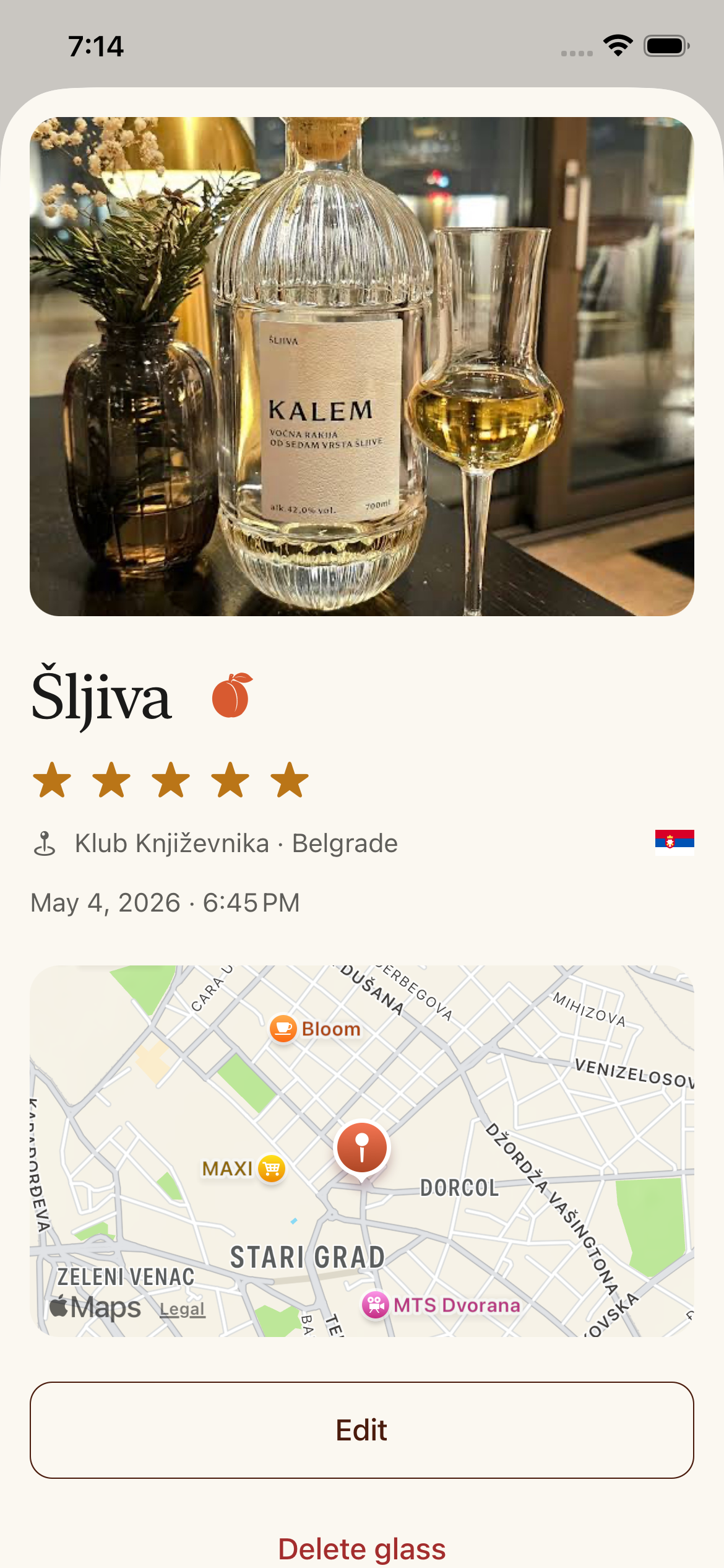
Log every pour of rakija — fruit, place, producer, photo. A personal record across the Balkans.

Notify me when it launches
{/* Phone mockup — wrapped in .kf-phone-glow for the honey radial halo behind the bezel. */}
); } // Desktop return (

A passport for
every glass.

Log every pour of rakija — fruit, place, producer, photo. A personal record across the Balkans, free forever.

Notify me when it launches
{/* Layered phone mockups (desktop only). Two screenshot phones (Discover + Šljiva fruit-detail) sit behind the foreground capture-sheet, tilted in opposite directions so the composition reads as a stack rather than three separate phones. The foreground stays the React-rendered CaptureSheet (so it animates / inherits brand tokens); the two behind are static screens inside the same .kf-phone bezel, keeping the bezel-color/radius consistent across all three. relative+overflow:visible on the wrapper lets the right- side bg phone bleed past the column edge into the section's cream margin without clipping. */}
{/* Background phone — Discover screen, peeks upper-left. Right offset (320 + bezel width) puts the bg phone clearly past the foreground's left edge, with the rotation tipping its upper-left corner away from the foreground. */}
{/* Background phone — Šljiva fruit detail, peeks lower-right. Negative right pushes it past the column's right edge into the section's cream margin. */}
{/* Foreground phone — interactive CaptureSheet, halo behind */}
); } // Three-up value props — Capture, Library, Passport // // Pattern matches ThirtySecondLog: overline → serif H2 thesis → // per-item grid. Per-item icon now sits inline (left) of the serif // title rather than stacked above it in a 44pt rounded box — pulls // the eye horizontally with the heading, denser visual rhythm. function Trio({ width = 'mobile' }) { const isMobile = width === 'mobile'; const isTablet = width === 'tablet'; const padX = SIDE_PAD[width] ?? SIDE_PAD.mobile; const items = [ { icon: 'camera', title: 'Capture', body: 'Tap +. A photo, a fruit, a place. The first sip is logged before the second.' }, { icon: 'book', title: 'Library', body: 'Twelve fruits. Eight regions. Producers who deserve to be remembered.' }, { icon: 'passport', title: 'Passport', body: 'A shareable record of where rakija has taken you. No leaderboards.' }, ]; const padY = isMobile ? 56 : isTablet ? 64 : 80; const titleSize = isMobile ? 28 : isTablet ? 28 : 32; // Icon scales with the title so the row reads as one composed unit // rather than icon-first / title-second. Roughly cap-height of the // serif h3. const iconSize = isMobile ? 22 : isTablet ? 22 : 24; return (
What it is

Three pieces, plainly told.

{items.map(it => (

{it.title}

{it.body}

))}
); } // 30-second log walkthrough — annotated 5 frames function ThirtySecondLog({ width = 'mobile' }) { const isMobile = width === 'mobile'; const isTablet = width === 'tablet'; const padX = SIDE_PAD[width] ?? SIDE_PAD.mobile; const padY = isMobile ? 56 : isTablet ? 64 : 80; const steps = [ { n: '01', label: 'Photo', body: 'Snap the bottle, the glass, the label. Or skip — words are fine too.' }, { n: '02', label: 'Fruit', body: 'Šljiva, kajsija, dunja… twelve to start. Or write your own.' }, { n: '03', label: 'Place', body: 'Where you are. The kafana, the home, the mountain.' }, { n: '04', label: 'Stars', body: 'Five marks. No vocabulary tests, no flavor wheels.' }, { n: '05', label: 'Save', body: 'Tap. Pour. Repeat.' }, ]; return (
The log

Thirty seconds, start to finish.

{steps.map((s, i) => (
{s.n} {s.label}

{s.body}

))}
); } // Passport showcase // // Tablet stacks like mobile — the PassportCard is ~320pt wide and a // 768pt viewport doesn't have room for it side-by-side with copy. function PassportShowcase({ width = 'mobile', dark = false }) { const isMobile = width === 'mobile'; const isTablet = width === 'tablet'; const isDesktop = width === 'desktop'; const stacked = !isDesktop; const padX = SIDE_PAD[width] ?? SIDE_PAD.mobile; const padY = isMobile ? 64 : isTablet ? 72 : 96; return (
The passport

Where rakija has taken you.

Cities walked, fruits tasted, countries crossed. A single card you can keep, share, or print. Updated quietly as you go.

    {[ 'Map of every Balkan country', 'Stats: glasses, cities, countries, fruits', 'Yours alone unless you choose to share', ].map(li => (
  • {li}
  • ))}
); } // Library — 12 fruits. // mobile → 2 cols (cards expand to share half the viewport) // tablet → 4 cols (3 rows of 4 = clean Pannonian-grid feel) // desktop → 6 cols, each card capped at 160px so they don't grow on // ultra-wide. Grid is centered when capped. function LibrarySection({ width = 'mobile' }) { const isMobile = width === 'mobile'; const isTablet = width === 'tablet'; const isDesktop = width === 'desktop'; const padX = SIDE_PAD[width] ?? SIDE_PAD.mobile; const padY = isMobile ? 56 : isTablet ? 64 : 80; return (
The library

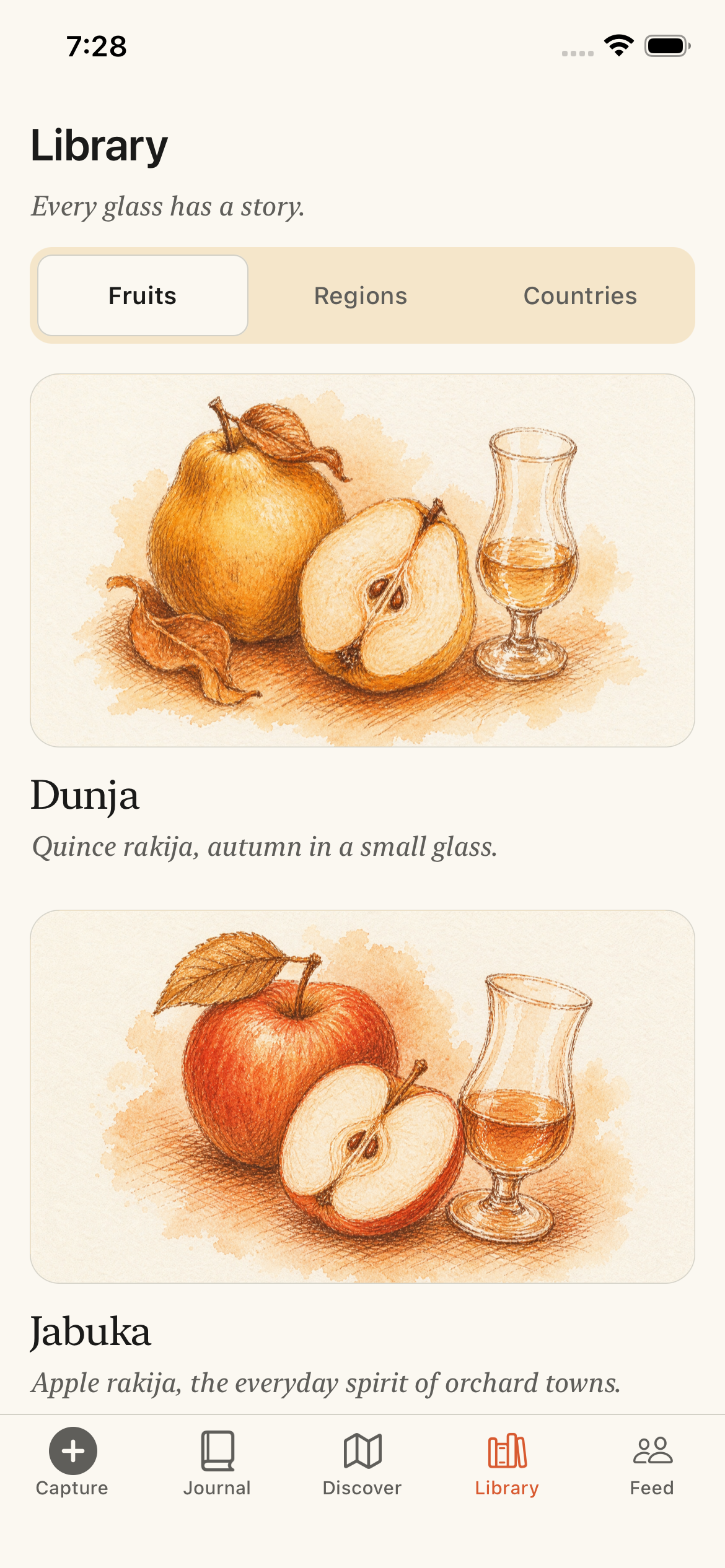
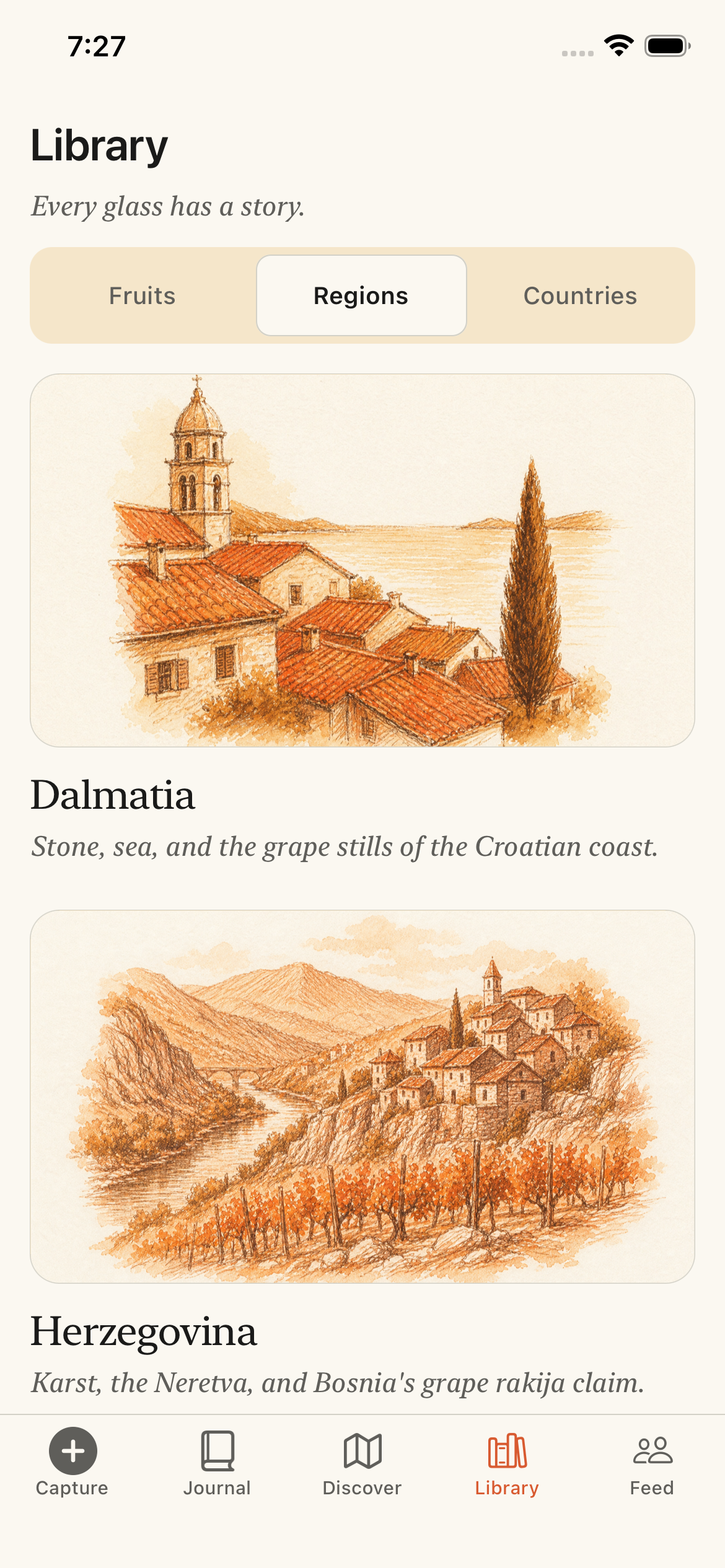
12 fruits. 8 regions.

Curated, not exhaustive. Add what we miss; we'll learn from it.

{FRUITS.map((f) => ( ))}
); } // Library feature — text-left, three layered phone mockups right. // // Mirrors the hero composition (text col + layered-phone col on // desktop; stacked single-phone on mobile/tablet). Foreground is // library1.png (Library tab with illustrated fruit cards); the two // background phones (library.png + library2.png) tilt away from the // foreground at -9° / +9°. All three are static screens inside // the same .kf-phone bezel — no interactive surface here, just the // hero-style stack. // // Slots into the page after LibrarySection (the at-a-glance fruit // grid) so the at-a-glance + the deep-dive sit as a pair, mirroring // how Capture pairs with ThirtySecondLog and Passport pairs with // PassportShowcase. function LibraryFeature({ width = 'mobile' }) { const isMobile = width === 'mobile'; const isTablet = width === 'tablet'; const isDesktop = width === 'desktop'; const stacked = !isDesktop; const padX = SIDE_PAD[width] ?? SIDE_PAD.mobile; const padY = isMobile ? 64 : isTablet ? 72 : 96; return (
Inside the library

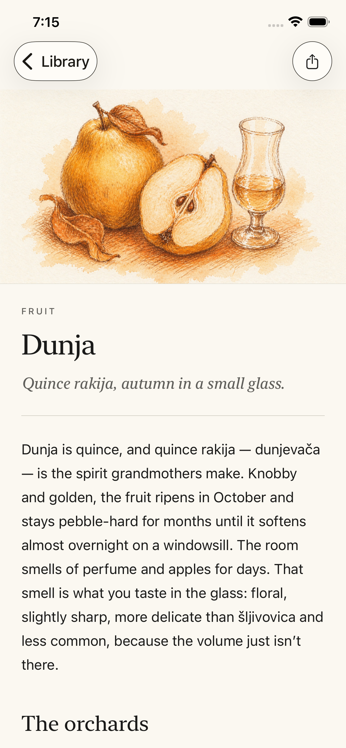
Each fruit, a small essay.

Each fruit gets its own page — story, regional variations, typical ABV, food pairings, the rituals. Cross-linked to places that pour them.

{stacked ? ( // Mobile / tablet: foreground phone only, centered, with halo.
) : ( // Desktop: layered three-phone composition. Same offsets the // hero uses (right: 320 / -150) so the two columns of the page // read as a coherent visual pair — both with the foreground // bezel right-aligned and bg phones peeking on either side.
{/* Background phone — Library list, peeks upper-left */}
{/* Background phone — secondary library view, peeks lower-right */}
{/* Foreground phone — library1 (the Library tab), halo behind */}
)}
); } // Pan-Balkan strip — Latin / Cyrillic // mobile → 2 cols (5 rows × 2) // tablet → 3 cols (4 rows × 3 = 12 with 1 trailing slot, 10 fit cleanly) // desktop → 5 cols (2 rows × 5) function CountryStrip({ width = 'mobile' }) { const isMobile = width === 'mobile'; const isTablet = width === 'tablet'; const padX = SIDE_PAD[width] ?? SIDE_PAD.mobile; const padY = isMobile ? 48 : isTablet ? 56 : 72; const markSize = isMobile ? 84 : isTablet ? 92 : 100; return (
Equal weight, every country
{COUNTRIES.map(c => (
{c.latin}
{c.cyr}
))}
); } // Plum-fill variant of CountryMark — used in the country strip so we don't // blow the "one copper per viewport" budget on this section. function CountryMarkPlum({ id, size = 100 }) { const muted = 'rgba(74,27,12,0.10)'; const filled = 'var(--plum)'; const stroke = 'var(--whisper)'; const vb = window.BALKAN_VB || '0 0 320 260'; return ( {window.BALKAN_PATHS.map(c => ( ))} ); } // Free forever function FreeForever({ width = 'mobile' }) { const isMobile = width === 'mobile'; const isTablet = width === 'tablet'; const padX = SIDE_PAD[width] ?? SIDE_PAD.mobile; const padY = isMobile ? 72 : isTablet ? 80 : 96; return (

Free.
No subscriptions. No ads.
Forever.

); } // Email capture section — single CTA that opens the same modal the // hero CTA opens. The disclaimer / no-spam line lives inside the modal // now, so the section reads as one clean confident button. function EmailCapture({ width = 'mobile' }) { const isMobile = width === 'mobile'; const isTablet = width === 'tablet'; const padX = SIDE_PAD[width] ?? SIDE_PAD.mobile; const padY = isMobile ? 56 : isTablet ? 64 : 80; const onFooterCtaClick = (e) => { if (typeof window !== 'undefined' && typeof window.openWaitlistModal === 'function') { e.preventDefault(); window.openWaitlistModal('footer'); } }; return (
Be the first to pour

iOS first. We'll let you know.

Notify me when it launches
); } // Footer — cream bg, 48px vertical padding, two rows w/ whisper divider above. function Footer({ width = 'mobile' }) { const isMobile = width === 'mobile'; const padX = SIDE_PAD[width] ?? SIDE_PAD.mobile; const links = [ { label: 'Privacy', href: 'privacy.html' }, { label: 'Terms', href: 'terms.html' }, { label: 'support@kafana.app', href: 'mailto:support@kafana.app' }, ]; return ( ); } Object.assign(window, { Nav, Hero, Trio, ThirtySecondLog, PassportShowcase, LibrarySection, LibraryFeature, CountryStrip, FreeForever, EmailCapture, Footer, EmailForm, });